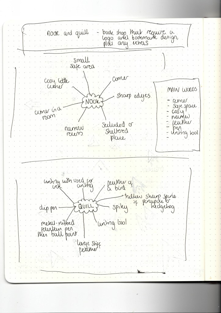
The brief was simply a book shop that requires a logo and bookmark design, plus any extras.

Below are scans from my sketchbook where I started writing out my ideas for the brand. The main words that stood out to me that I wanted to take further were ‘corner’ ‘safe space’ ‘feather’ ‘writing tool’.
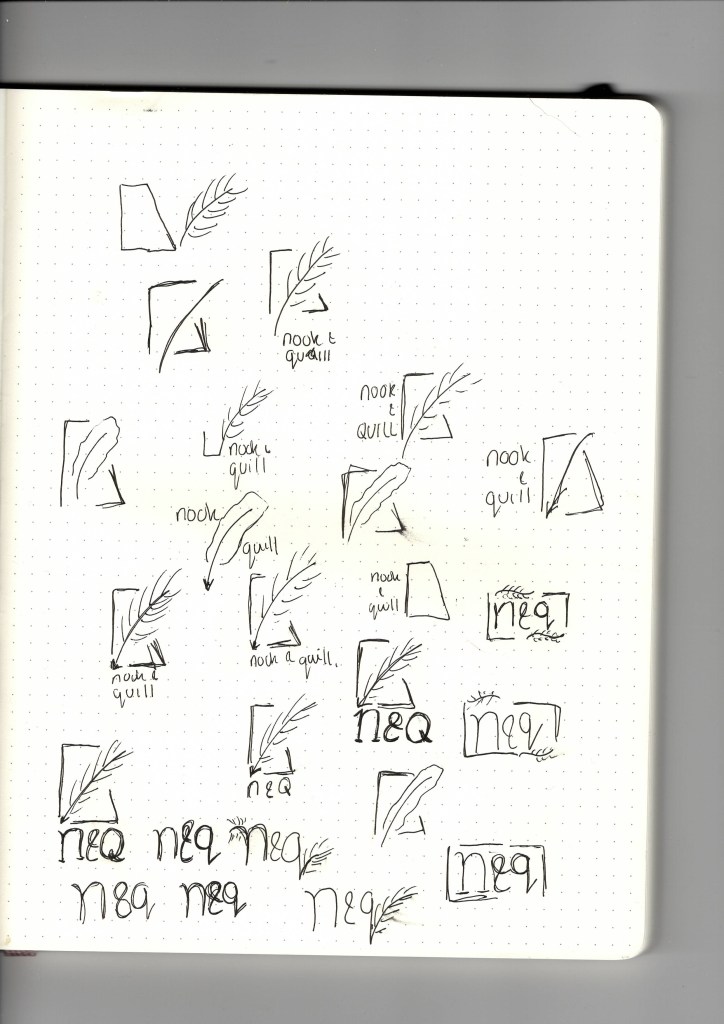
When creating the logo for this brief, I knew I wanted the logo mark to be a mix between the two nouns in the name of the brand. When brainstorming the word nook, the idea of a cosy corner to read in came to mind. This is replicated into the shape of the lines in the logo mark, to help shape the logo and give it some structure.


As soon as I started getting inspiration for the brand (images above), I knew pretty much straight away I wanted a shape of a nook in the logo to give it structure, I wanted the quill to be inside the nook, as a nook is a cosy space, to give seclusion or security.

With the quill, I wanted an illustration of a feather as the focal point of the logo, with the nib of the feather pointing down towards the logo type. Initially I was looking at the style of the top row, a more cartoon style. I realised it wasn’t portraying the look I wanted to so i tried illustrating it myself on procreate and this created the look I wanted for this logo as I went for the last feather in the image.
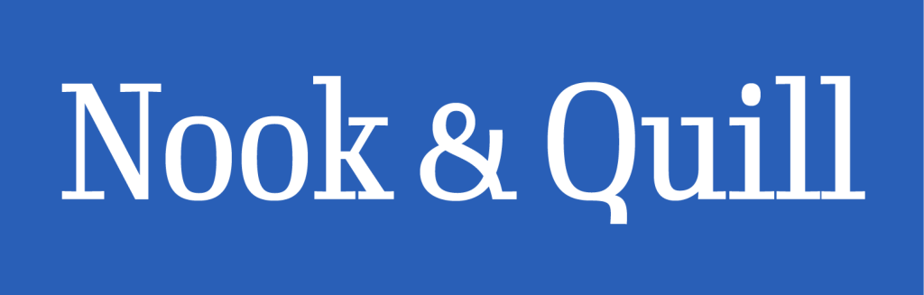
The font of the logo type I used was Gimlet Display Narrow. I wanted to use a serif type to give the classic look, as serif types originated from the first official Greek writings on stone, and quills were used until the mid 19th century so I wanted to create a classic traditional feel to the logo.

i used this shade of blue #295fb7 as i believe it radiates the feeling of calmness and relaxation which is the aim for book companies to create this atmosphere when entering a bookshop so this felt like a perfect choice for it.
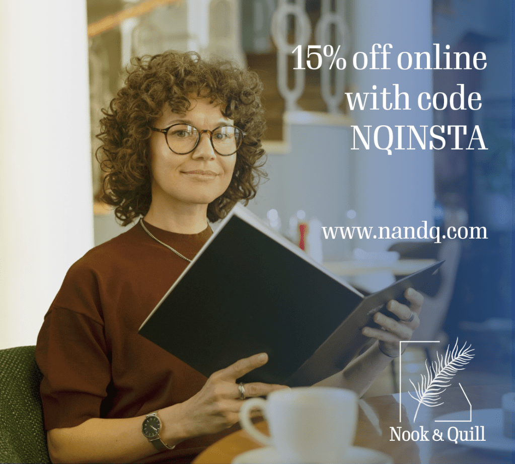
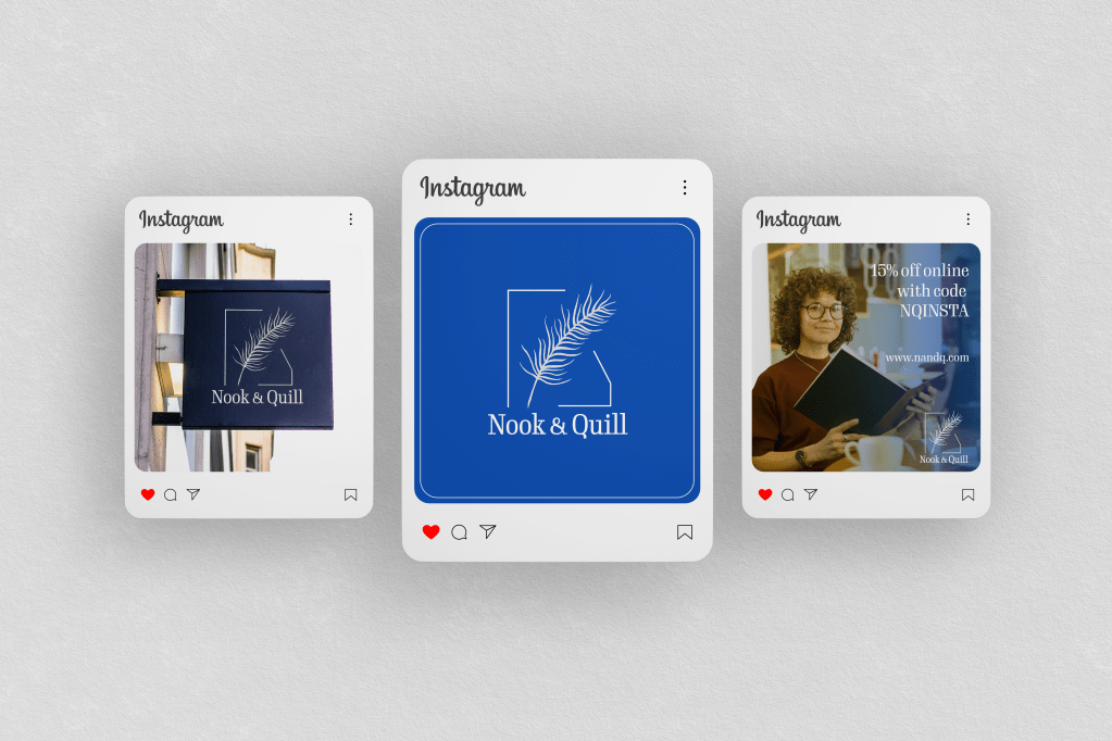
Above is an example of content I created that could be used as a potential social media post for the company. It shows a smiling human reading which conveys an inviting atmosphere to try and entice customers to the book company.
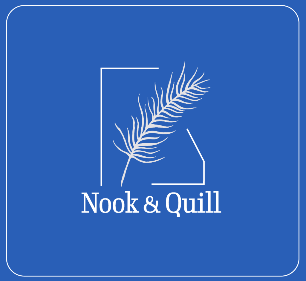
This is another potential instagram post the company could use, very simple with the logo being the only feature in the post, with the brand colour being the background. Below is the content I have created for the company’s instagram.