The task at hand was to develop a new logo to signify a new brand identity for Point Delivery – a delivery service that is known for their stellar track record of on time deliveries and their outstanding customer service. The goal was to create a logo that would help the company to grow the presense of their brand on a national scale. Therefore the logo needed to be easily recognisable, sharp and corporate friendly. The logo was to be easily recognisable and and needed to be suitable to be applied to the company’s lorries and delivery vans. The key is for the logo to exude professionalism and reliability.
Creating the Logo
This was the photo supplied to for inspiration. Straight away i knew the company wanted a logo that was simple, slick and not too much detail, and something that would be easily recognisable. The simplicity of the logo would bring across the message that the services of Point Delivery are simple to use with little to no problems.
First of all i wanted to focus on the logo mark. Creating the logo, instantly the concept of a point came to mind in relation to the company name Point Delivery. However their great record for the fast deliveries also came to mind, which made me think of the concept of analogue clock hands. The point i wanted to create for the logo would replicate this, to insinuate that time is very important to the company.

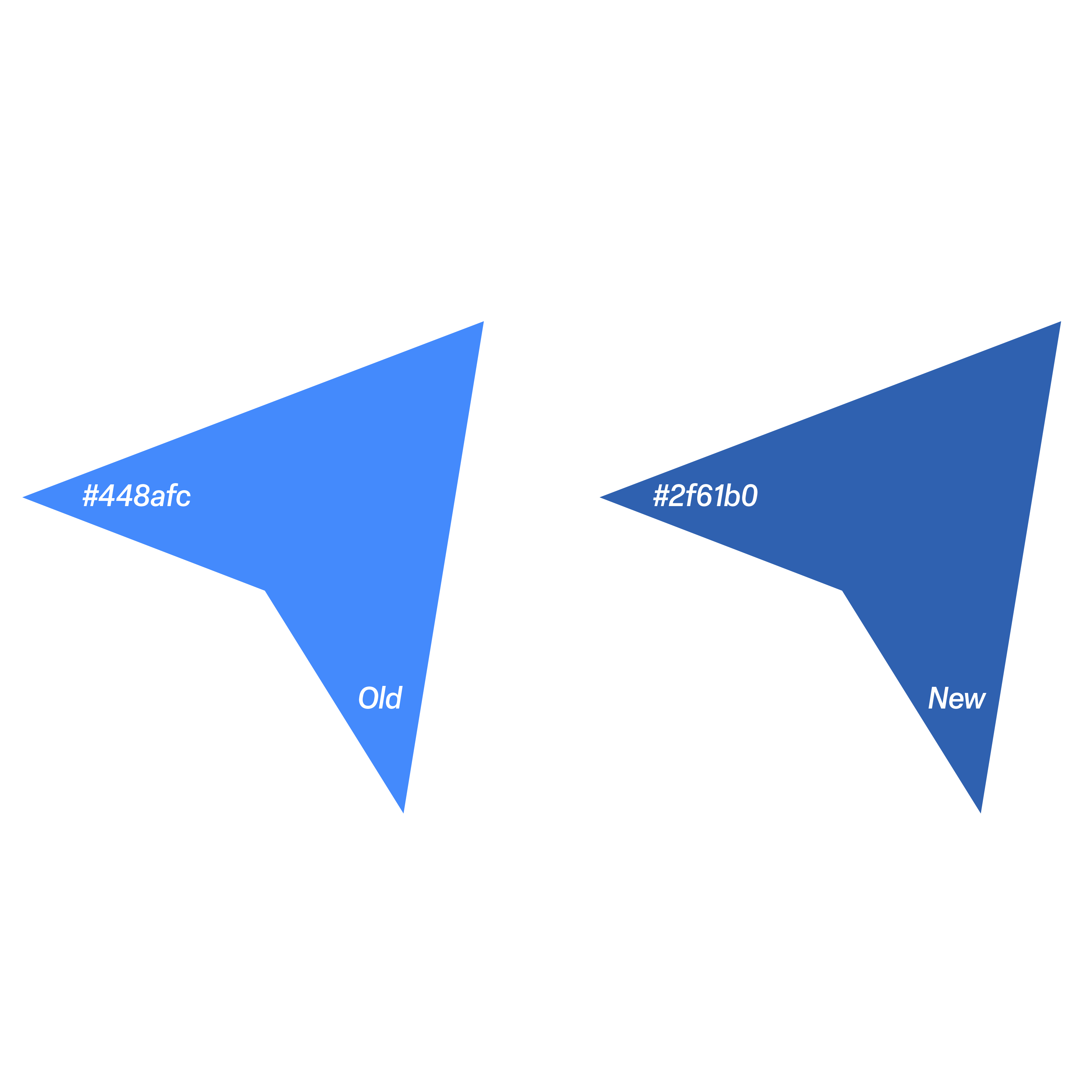
In the brief, it was stated by the company that they were open to new colours yet they still wanted to convey reliability and trust. I stayed with the colour blue however i increased the value of the hue and changed the colour into a darker blue. Dark blue exudes power and responsibility. The darker hue emphasises the reliability and trust element and is also associated with knowledge. This is crucial for a delivery company as customers need to know they can have a trustworthy service with a company that knows exactly what they’re doing and can get it right every time.
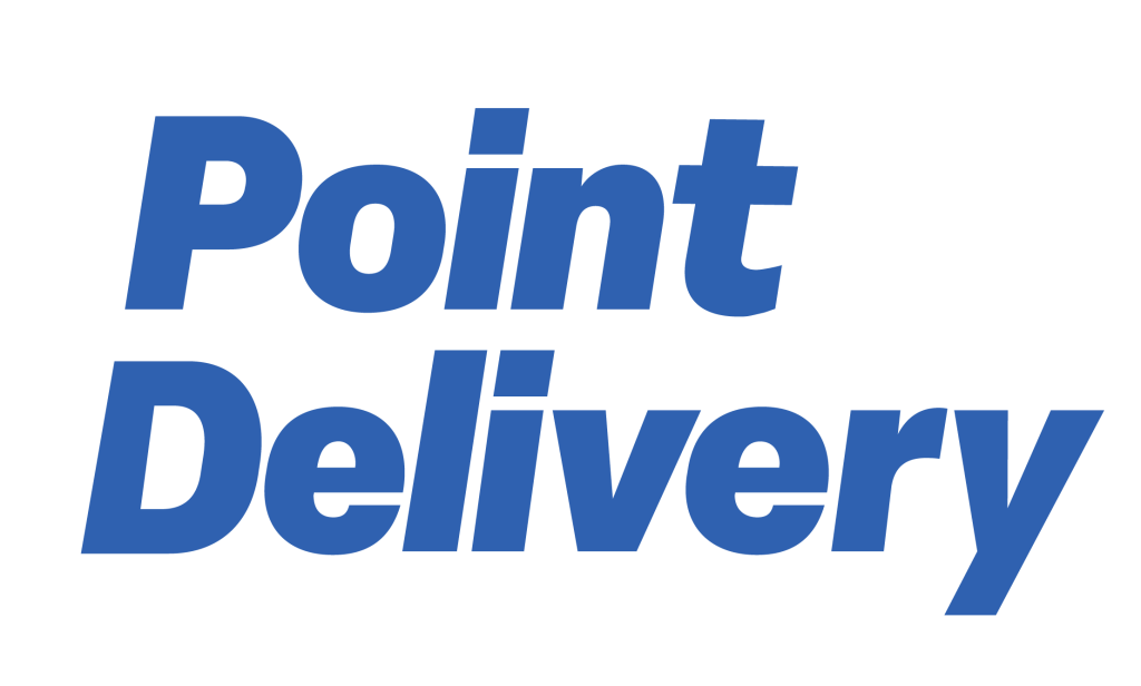
The font i have chosen for this logo is the Elza font, using the Black Oblique variation. I really wanted to put a slant on the text as it gives the impression of movement. This is to signify the drivers for the delivery service are always on the move. I changed the shape of the inside of the ‘e’s slightly to give them a more cartoon eye shape as if they’re smiling, to give a more positive feeling around the brand when the consumer views the logo. I also extended the ‘Y’ to elongate it to match up with the slant of the logo mark.
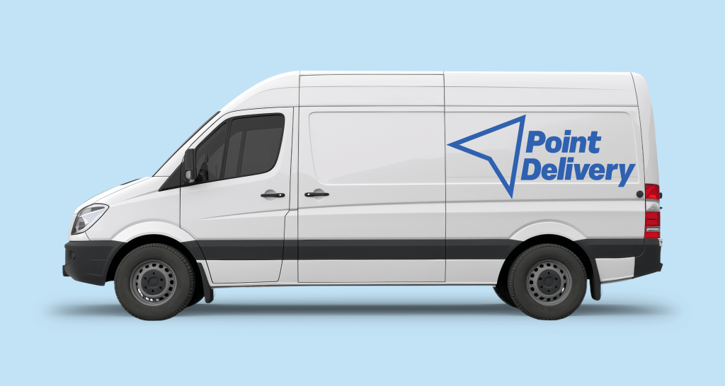


The company wanted their logo to be easily recognisable on delivery vans and lorries so i have created a few mock ups to show how the vans would look like with the company’s logo printed on the side of the vehicle.
I believe i have given the company a professional trustworthy look that lets them compete with the other delivery services in the market.
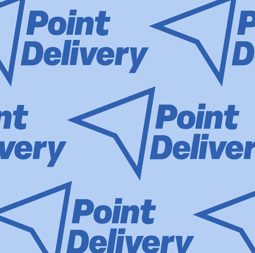
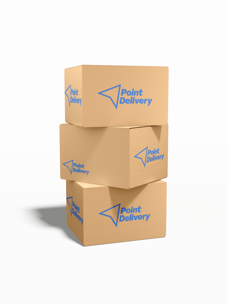
I created this brand patter above that could be used for packaging, but also I have created a mock up below to show how this can be used on products.

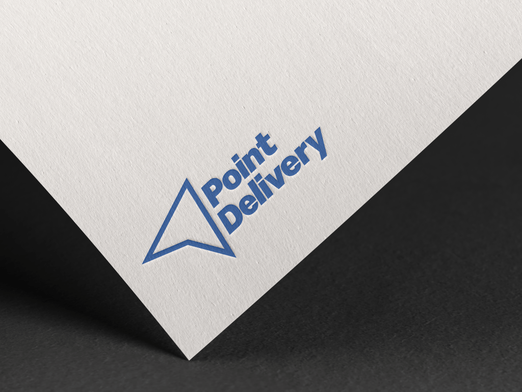
I have created mock ups to show how this logo could look on correspondence and the brand’s packaging.