Passion Project
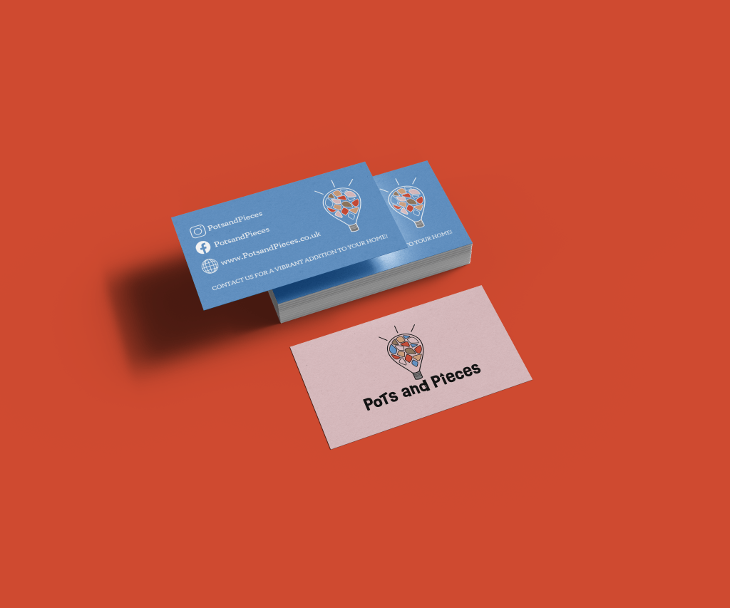
Pots and Pieces are a forward thinking pottery company.
They are passionate for sustainability so they breathe new life into old pottery works and broken pieces. They take donations from their customers and turn their previously unusable art into decorative pieces that will add vibrancy and fun spirit into the home. They’re the new business on the block and feel strongly about channeling their innovation into their branding.

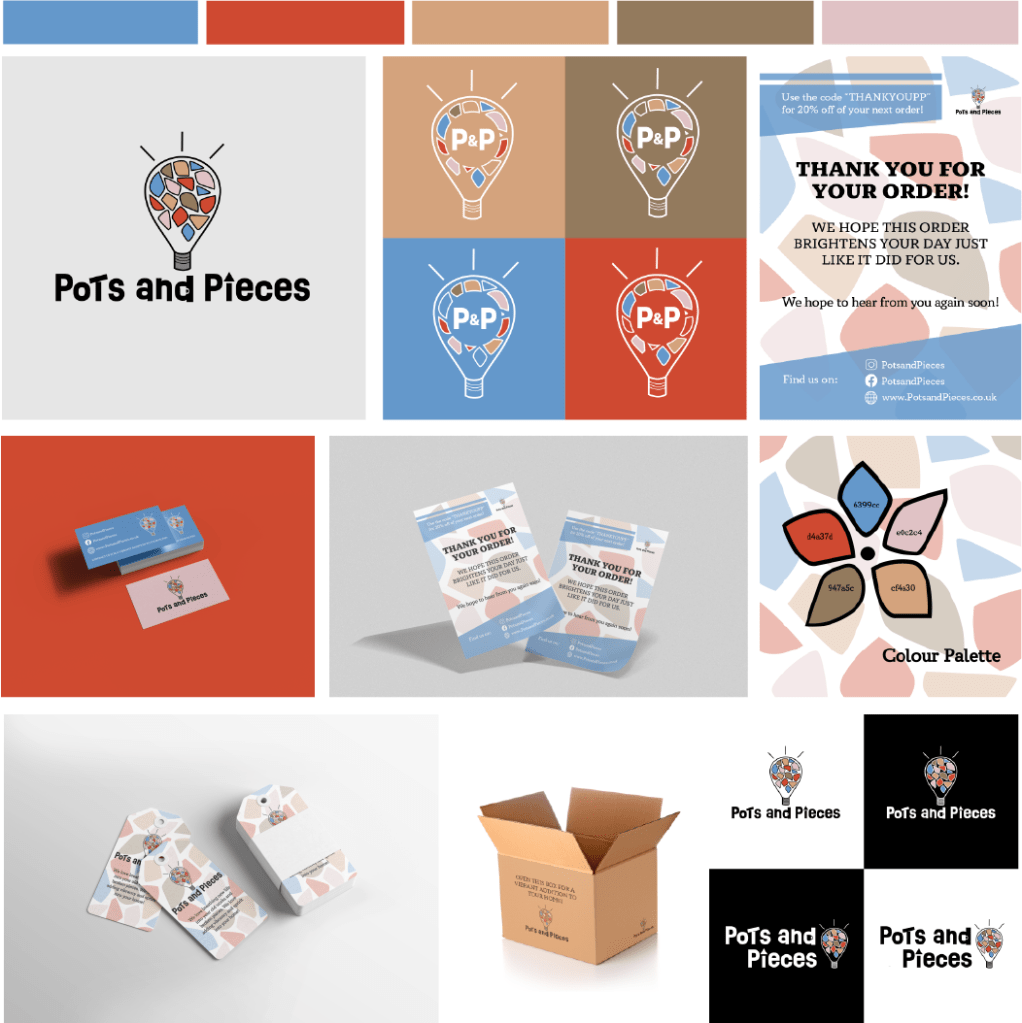
The logo above is the primary logo I have went with. The logo to the left is the secondary logo that can be used if the above logo isn’t the correct space for the style of branding.

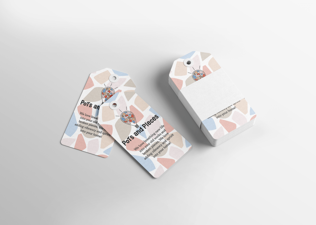
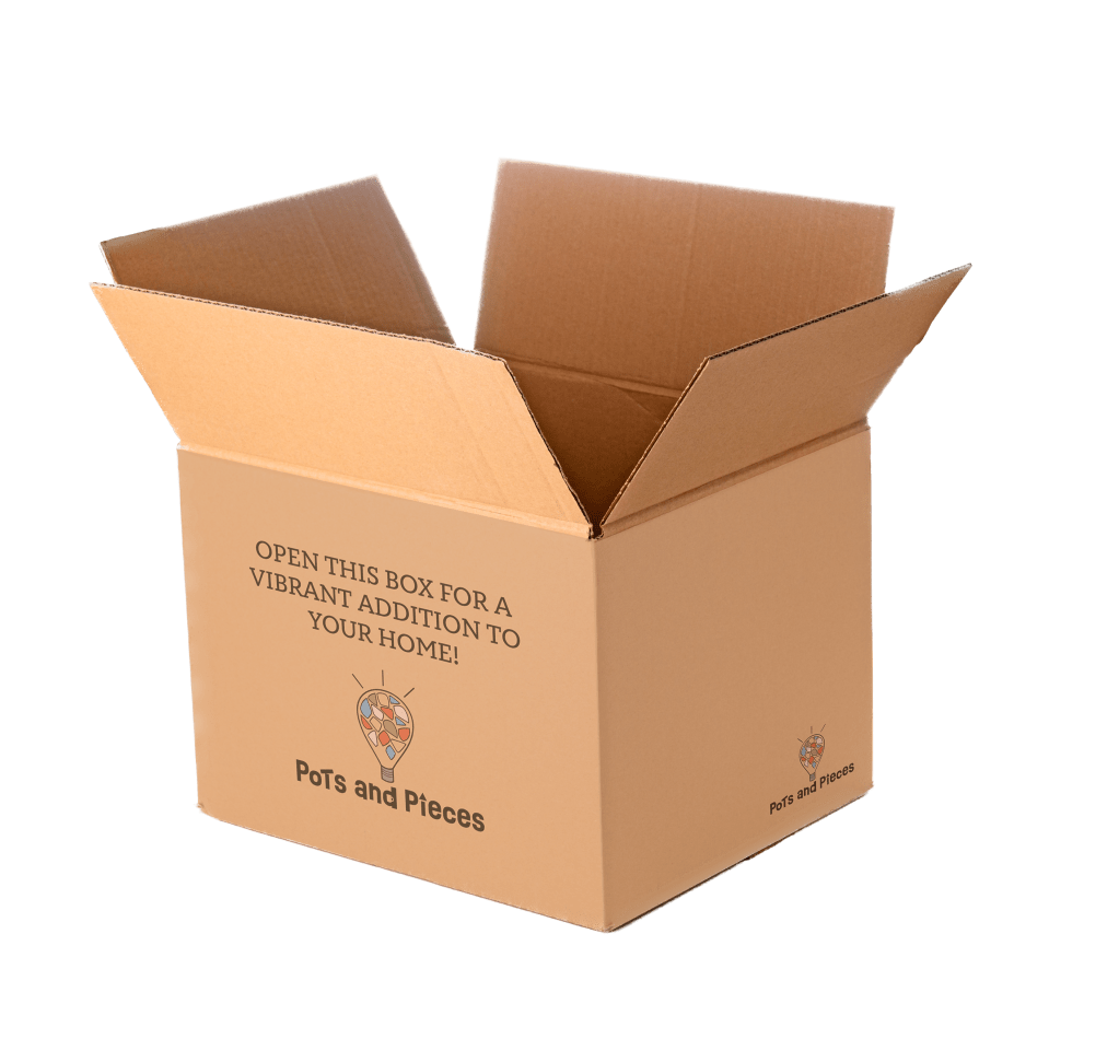
The packaging designs chosen for this project maintains the mosaic pattern used throughout this brand. The cardboard box is simplistic yet encourages the consumer to look forward to opening the package to their new/old pieces.
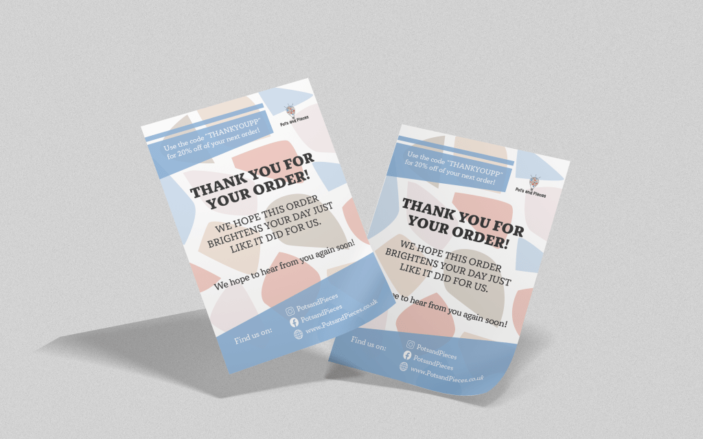
The inspiration for this branding was the uneven shapes of clay found when a clay item smashes, it also creates a mosaic vibe to the design. This abstract shaping is found in the brand pattern found in the flyer and the packaging tag. The shapes on the flyer behind the text also indicate the uneven shapes, this creates an element of interest and creates the message that each item this company produces is slightly different and a bit out of the ordinary.
The colours are vibrant enough to insinuate the clients pottery will be a new vibrant design yet still muted enough that they’re realistic colours you’d fine in a pottery line. The inspiration for the colours comes from the mosaic designs that would be found in the Egyptian era and the Ancient Greek mosaic art that would be created out of pebbles creating interesting and various patterns.
Thanks for your time!
